Floral Experiences for Brand Moments
When Grow Marketing invited us to design florals for a screen smart event in Chicago, we approached it with intention and care—focused on how thoughtful floral design can completely shift the feeling of a space and elevate a brand experience.
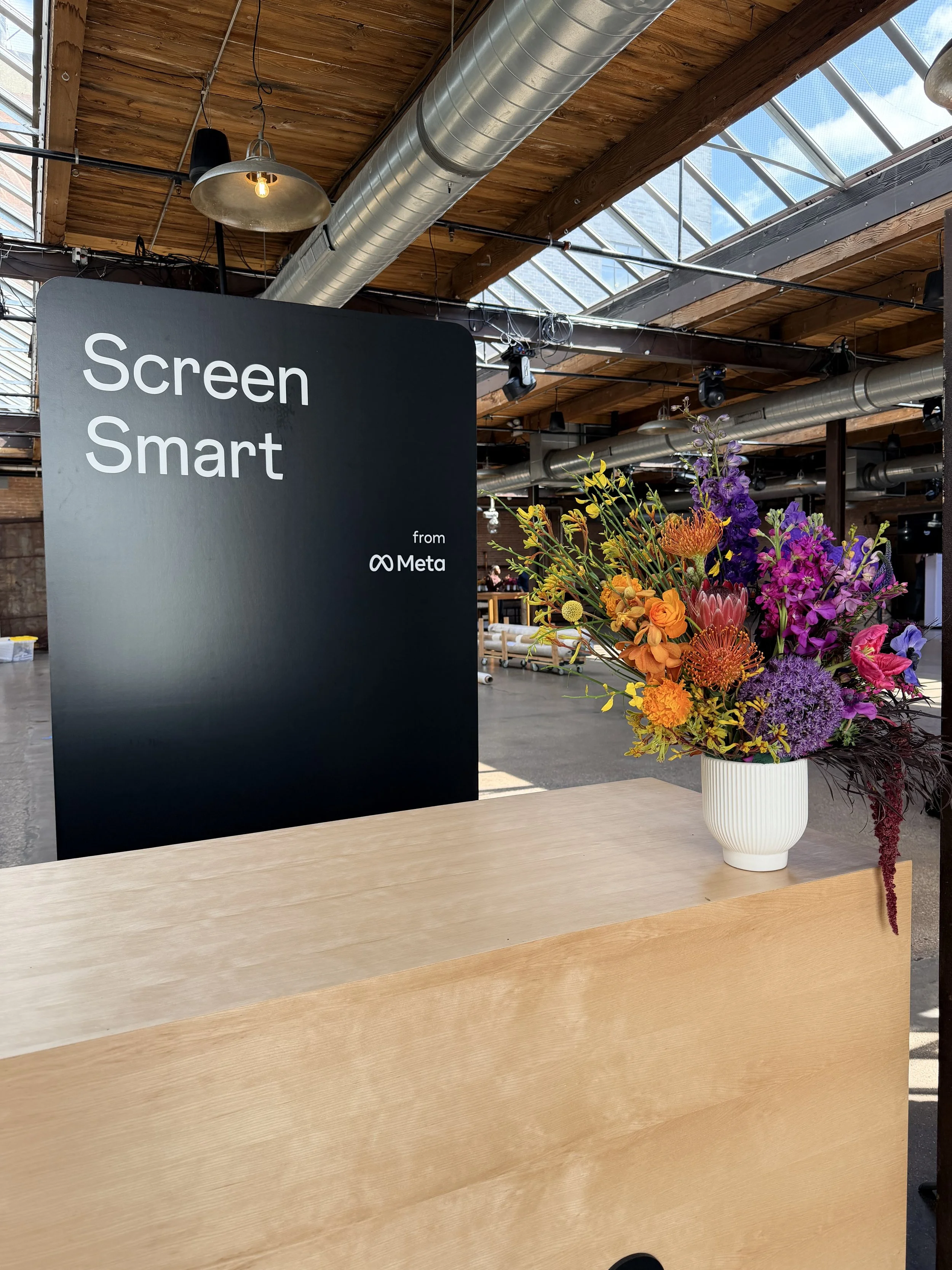
Our floral design services are rooted in storytelling. We don’t just place flowers in a room—we design with color, movement, and emotion to create an atmosphere that feels intentional, layered, and alive. For this project, the concept was a monochrome dream, and we used that as a foundation to build something soft yet striking for a highly structured, tech-forward environment.
Color Story Reimagining a Tech Brand Through Floral Design
One of the most meaningful parts of this project was translating the Meta logo into a floral expression. Instead of a literal interpretation, we built a color story that reflected energy, warmth, and contrast.
For us, color goes beyond appearance—it sets the tone for the entire space. It creates flow, draws focus, and influences how people naturally move and connect within the experience.
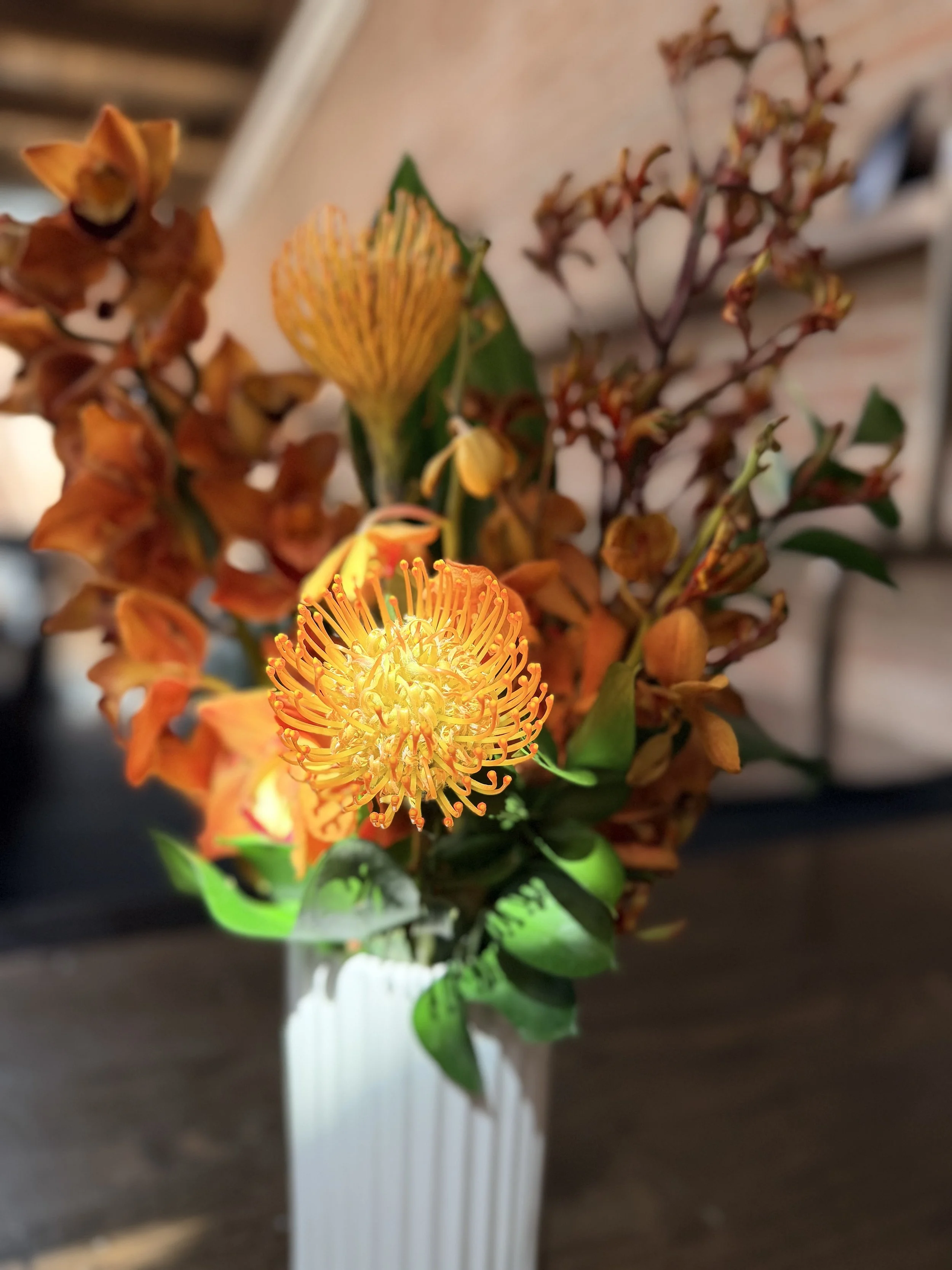
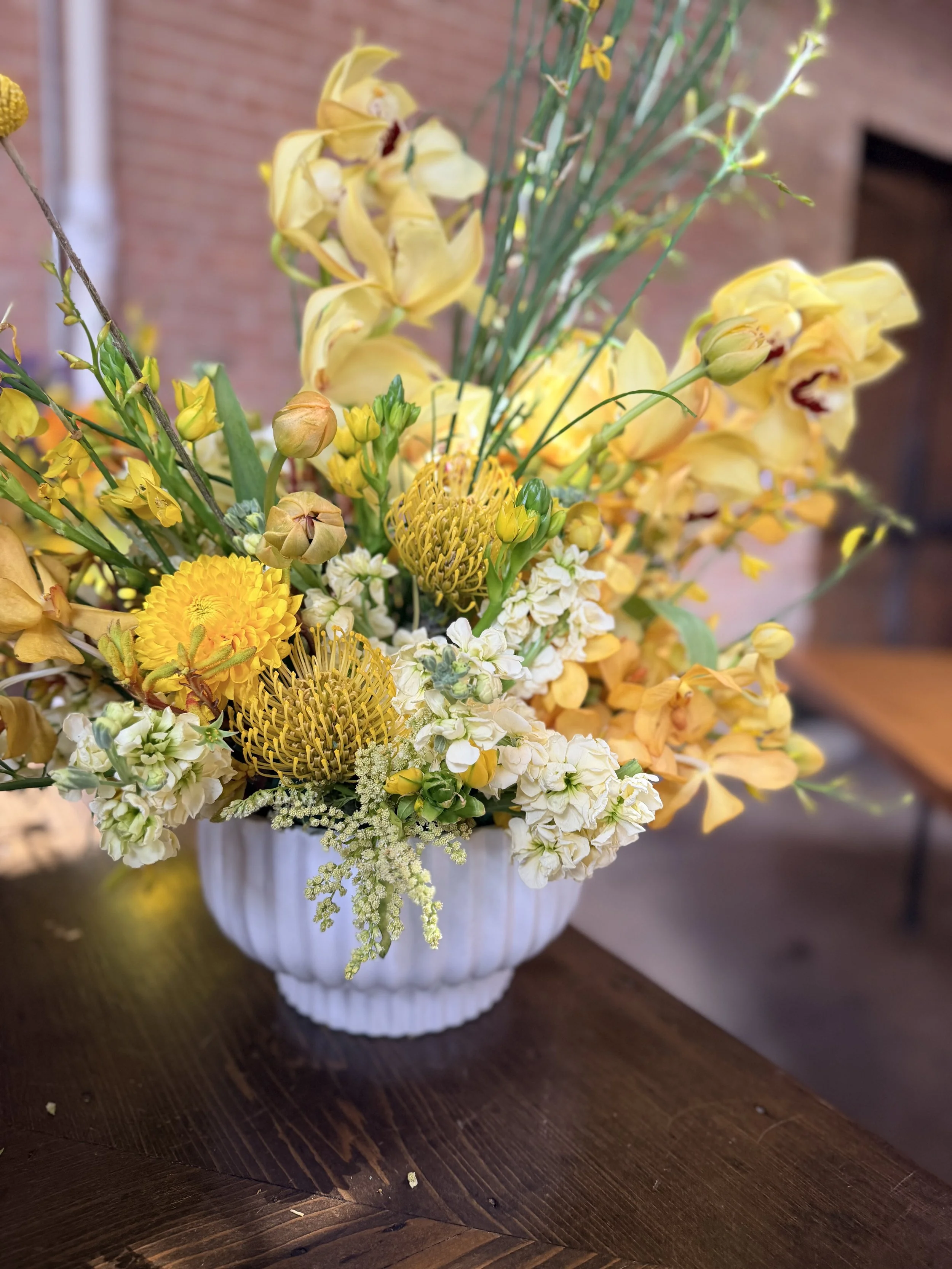
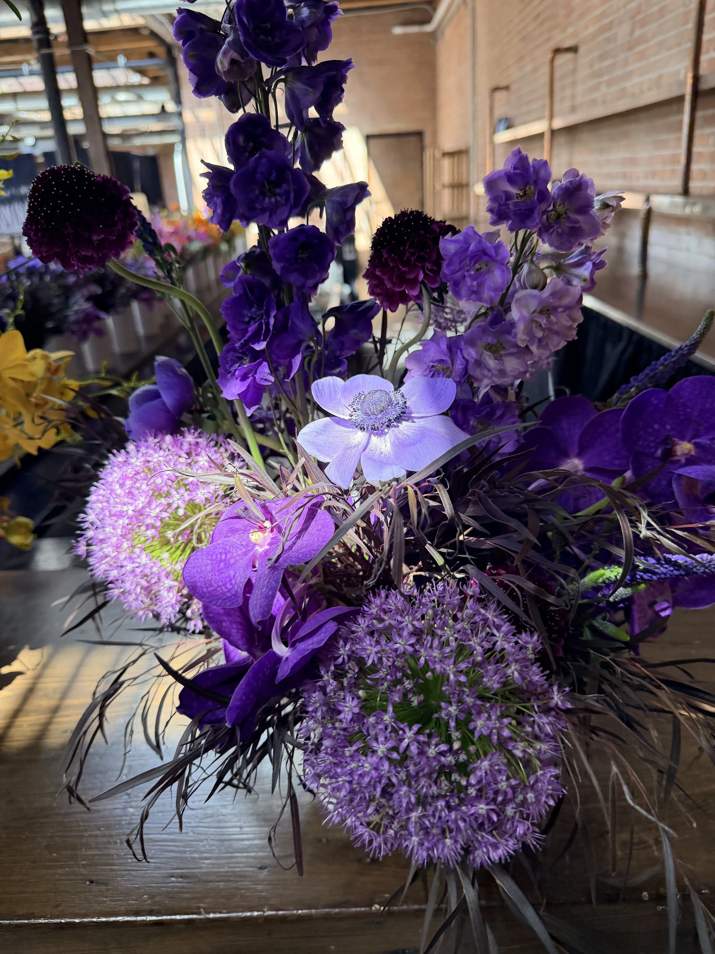
For this palette, we built a layered color story using orange, yellow, purple, and pink—each one playing a unique role.
Orange became our anchor. We used it to create moments of focus—pulling people in and giving the design a sense of movement and direction. It’s bold without feeling overwhelming when placed with intention.
Yellow was our light source. It lifted everything around it—softening edges, warming transitions, and making the overall palette feel open and inviting. It’s the color that made the design breathe.
Purple added depth and contrast. We leaned on it to ground the brighter tones and bring in a more elevated, thoughtful layer. It created balance—keeping the palette from feeling too one-note.
Pink was where we softened everything. It blended the transitions between colors and introduced a sense of ease. It made the entire design feel more human, more approachable, and more connected.
Together, these hues created a balanced floral palette that felt bold but still cohesive within the brand world. The result was a visual moment that softened the space and brought a sense of warmth into an otherwise digital-heavy environment.
Structure, Color, and Emotional Impact
This project reflected what we love most about floral design for events—the ability to shape how people feel inside a space.
In a setting filled with screens, clean lines, and minimal structure, florals bring contrast. They slow the moment down, add texture, and introduce a human touch that can’t be replicated digitally. That balance is where the magic happens.
A Design That Extended Beyond One Event
What made this experience especially rewarding was how the work lived on after the event. The client connected so strongly with the floral direction that it became part of their nationwide design guidelines, influencing how they approach future spaces and experiences.
That kind of impact is what we aim for—design that doesn’t just decorate a moment, but informs what comes next.
Floral Design That Brings Events to Life
This project is a reminder that florals are not an accessory—they’re an essential part of how a space communicates emotion and identity.
If you’re planning a corporate event or brand experience in Chicago, or even beyond, and want floral design that feels intentional and elevated, we’d love to connect. And yes—we can absolutely travel nationwide too to bring these experiences to life wherever they’re needed.